2")


 on body 1")
2")


 on body 1")
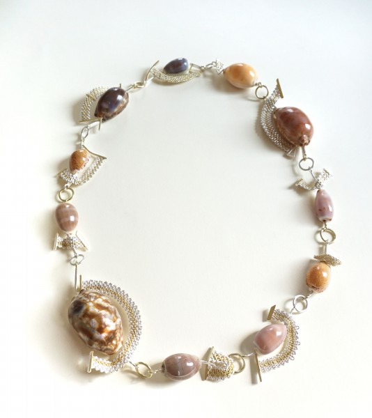
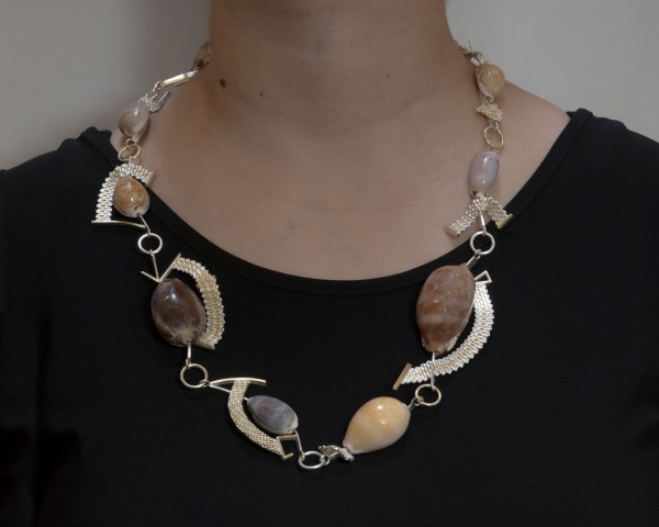
| Materials | Necklace. Copper, sterling silver, foils. |
|---|---|
| Dimensions | 12” L x 13 1/2” W x 1 5/8” D |
Description
“My interest in “piercing” started even before I began making jewelry. Before discovering metal arts, I was cutting paper to make decoupages. Unknowingly, my work reflected William Morris’s patterns — something I like to think comes from a shared way of perceiving the world.
These days, I draw simple designs first. Cutting individual fine lines is very time consuming, but the finished creations give me impressions of elegance and mysterious beauty. I am totally fascinated with the subtle lines near the breaking points. I pierce my designs, which are usually etched onto the copper beforehand with a jeweler’s saw. For this piece, I created around 40 various sized butterflies. Some are riveted to give more depth as three dimensional shapes. Some, however, are left as singles so that they stand out on a canvas — which is a human body.
Once the butterflies were pierced and (some) riveted, they were oxidized to create a black base. Then, they were sealed half a dozen times in preparation for the next step.
I chose blue to guild on top of the black, to serve as the foundational color for the butterflies. Blue symbolizes the sky and the sea, as tranquility and calm. However, blue also has a negative side: melancholy and isolation. Feelings many of us have battled ever since the start of the pandemic.
Our everyday lives came to an abrupt stop. Going to school, to work, shopping, even just seeing people suddenly became dangerous. Wearing a mask, social distancing, and scrubbing down everything from outside became the new norm. We became trapped in our homes, our cages.
I added green to the blue to create a sense of purity; to bring the negativity out from below. Green is a warmer color in which, I believe, heals those injured feelings. Even though I used a greater amount of blue, interestingly, the butterflies look more green in the end.
As for the other butterflies, I added purple over the blue. Purple symbolizes sacredness and dignity. These difficult times have taught people to be more kind and help each other. The purple transcends the blue.
Finally, each piece was gently hand coated a dozen times to protect the guilding.
I tend to stray a lot from my initial designs as I get more “directing” from elsewhere while working with my pieces. Often, I inexplicably change the positions to what feels right. To where they belong.
The butterflies are flying to comfort our hearts.